ICMD-Branding
Description
Indian Center of Modern Design (ICMD) is a museum that showcases the works of modern Indian artists. They collaborated with us to create a whole branding strategy that would strengthen their values and visibility.
Client
ICMD-Mumbai*
Year
2024
Category
Brand Identity
The Story Behind
It all started with some simple questions: "What if India had a dedicated museum just for design?" "How would it look?" "How would they present themselves?" and many more. To find all the answers, we started building this concept project called "Indian Center of Modern Design."
The Art Direction
I myself, being a designer, always liked minimalism. This design approach conveys a strong message with visual clarity and avoids unnecessary complexity. For this project, we aimed for a minimalist aesthetic while ensuring the brand's core values remained intact. As this brand's target audience is creative minds, that's why we integrated abstract elements into the minimalist framework.
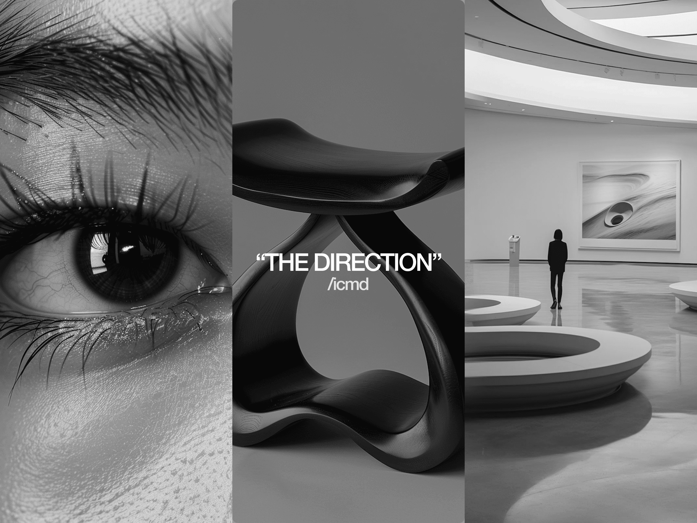
Style Scape
We wanted to go with a style that speaks creativity. We thought of focusing on gradients because their smooth transitions represent the natural flow of creative work. Gradients were one of the key design elements of the whole project. We also tried to go with some vibrant and positive colors. To keep the minimal aesthetics, we went with a modern sans-serif font.

Thinking Behind Icon Mark
Our goal was to design a simple, distinctive, and abstract logo. The icon mark for ICMD consists of four different abstract geometric shapes; when those come together, they subtly form the letters "ICMD." This bold, minimalist design reflects the spirit of a creative mind. Its simplicity makes it easy to remember, which should help build brand recognition with our target audience.


Design of Wordmark
We were inspired by the simple, modern typography of MoMA's branding, which catches everyone's eye. We wanted to archive the same with our ICMD wordmark. We have crafted the wordmark by simply combining the icon mark with a suitable modern sans-serif font.


Colors & Typography
Aside from gradients, we also needed some solid colors. We used a range of vibrant colors to complete the brand identity system. These colors will create a visual contrast in the designs. For the typographical system, we have chosen two sans-serif fonts: Inter & Unbounded. Inter will mainly be used in the logo marks, body copy, and small areas, and Unbounded will be the display font for ICMD. It will be mainly used for marketing and stuff.

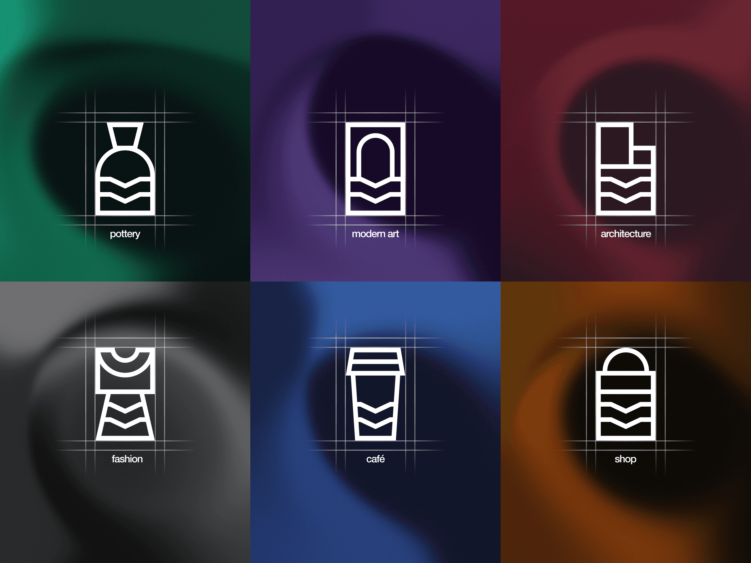
Icon Set


Brand in Action


*The Indian Center for Modern Design (ICMD) showcases our design studio's creativity and innovative methods. This project is purely conceptual and not linked to any real-world entity as ICMD-Mumbai